🧱#8: The VC Rebrand Guide
Rebranding and revamping your website is no easy task. We lay out step-by-step how we did it for focal, all the way to launch.
Brick by Brick is a monthly newsletter where we share our thoughts about building a venture firm.
If someone forwarded this to you, subscribe here to get the next one in your inbox.
Home Makeover: VC Edition 🏡
We’re fresh off a rebrand from our legacy brand, Darling Ventures, to our new and refreshed brand - focal. Same firm, same strategy with a new name and sharper positioning.
While this all sounds exciting, geeeeshhh it was a lot of work.
But if you (like us), feel that your firm has graduated beyond its brand or has just outgrown its old threads (via a shift in focus, a merger, or maybe your logo feels a bit ‘90s), then it’s worth it.
This article from Liz Cohen at Hetz Ventures does a great job at breaking down the why and when of a VC rebrand. Thus, we decided to focus on the how in this write up.
🎁 We’ve also included a few resources we put together, in hopes that it helps you tackle the logistics, including:
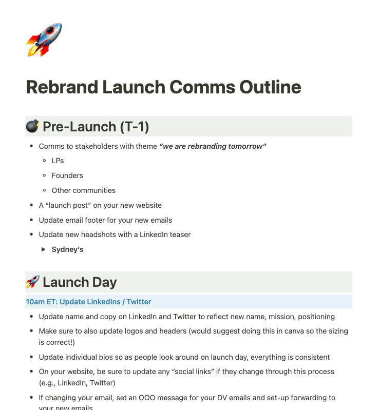
Launch Comms Timeline
VC List of Lists
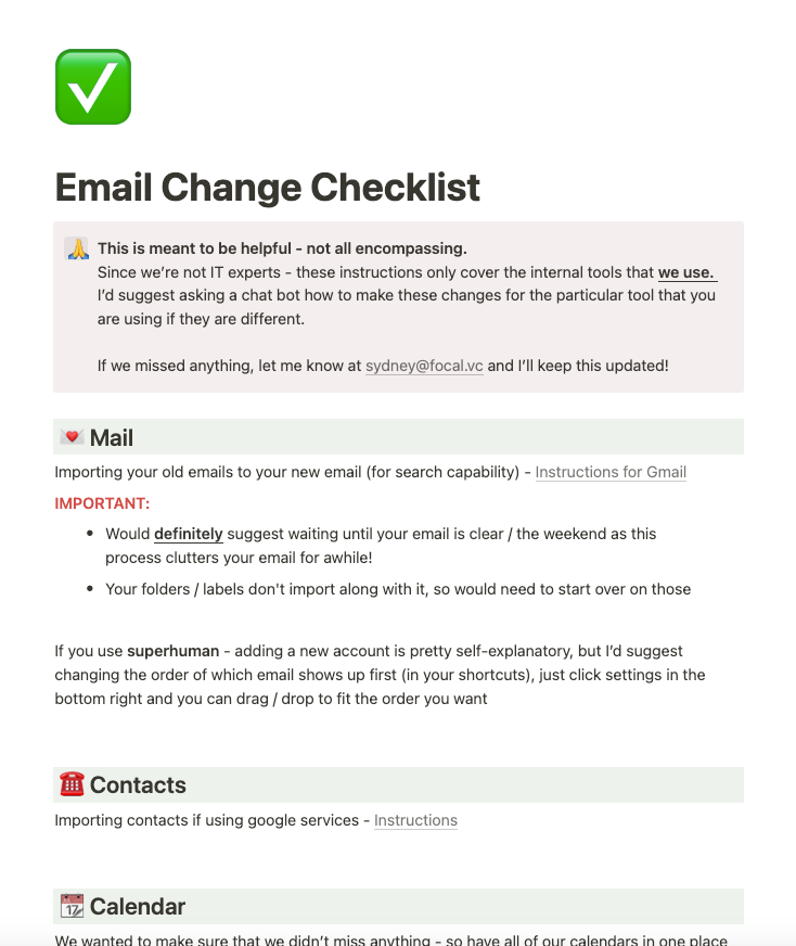
Email change checklist
Here are the three phases of our VC rebrand:
🎨 Phase 1: Brand Creation
Defining the new brand: Our journey began with a robust exploration of our brand's identity and positioning. While some firms delegate this to agencies, we recommend doing this work yourself and using your founders as a sounding board. No one can articulate what YOU stand for, better than YOU! Our goal was to craft a brand that is modern and approachable, yet bold with simple and compelling positioning. Easier said than done, as it took us a few iterations to get there. Ultimately we feel like we landed in a good place.
Choosing a name: We must have tossed around hundreds of options, consulted word generator websites (e.g. Namelix), googled thousands of synonyms, almost landed on a few other names, and used our lawyers more often than we'd like to admit (to help us use the name properly). Our best suggestion here is to set up a (Slack) channel specific to this topic allowing a space for stream of consciousness.
💡 Pro Tip: Give it time. A name you love today, you might hate tomorrow. Let things simmer and at some point, you’ll have the aha! moment. That said, as long as a name isn’t offensive or too silly, it’s what you make with it that matters most.
Finding the right brand designer: Restaurants have an owner and a chef 👩🍳. Almost everyone would agree that the chef is more important. In our case -the chef was a rockstar brand designer. We held countless meetings, relied heavily on references, and meticulously searched for someone who understood our vision. The biggest challenge here is that designers don’t share teasers for your brand, only their portfolio. So you have to know, generally, what you are looking for before going in and (partially) hope you get lucky with your pick.
💡 Pro Tip: Avoid all of this hardship and just use Adam at What Else Studio. That’s who we used and we could not be happier 🫶🏼
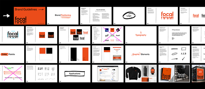
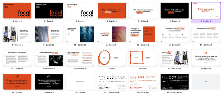
Logo and brand design: We gave Adam a vision board, our likes and dislikes, and held a bunch of discovery chats going through brand design options. He turned all of that into something special. Below is a look at some of Adam’s work and you can go here for his full case study.
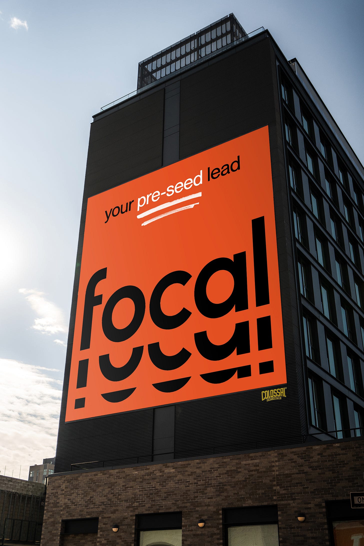
💡 Pro Tip: Ask your designer to put together fun brand assets. We used “fake” billboards for our announcements and they landed quite well - such as the one below (a lot of people asked us if we actually got a billboard).
Last step, our website: Tbh this could be an entirely separate post. But we managed to build something we're proud of, reflecting our brand ethos while getting everything we wanted across (thanks also to Andres the Webflow wizard). What helped on web copy was starting with a “stream of consciousness” / get everything on paper method, and then a heavy handed edit - we shed a good 70% of the initial copy text over several iterations.
💡 Pro Tip: We used Canva to mock up pages with text (next to our designers translating that into Figma). This helped us streamline, as visualizing it made us realize that our initial copy was way too long / the flow didn’t make sense. Only after we had aligned on it all did they start creating the website in Webflow.
Here’s how it turned out!
🚀 Phase 2: Launch
Now that you have everything ready to go, it’s onto the big reveal! This also takes a bunch of prep to do right…
~3 weeks before launch, we began generating buzz with teasers, mentioning it in our newsletters, and having some candid chats with important folks in our network.
As part of that effort, we made sure that our most important stakeholders (LPs and Founders) first got the news directly from us before hearing it elsewhere.
A few days before launch, we rallied our networks, asking them to interact with our announcement post to get that sweet, sweet LinkedIn Algorithm attention.
💡 Pro Tip: When asking folks to share / comment / engage, give them ideas of what to say or topics to mention as it mitigates the cold start problem
On launch day, it was all hands on deck. We created and shared a series of launch messages and design assets, and made sure to engage with our audience throughout the day. Took us out almost the whole day but it was worth it as many folks mentioned that they saw our launch in a lot of places / we got quite a few interesting investment opportunities out of the buzz created.
🏁 Phase 3: The After
It’s all fun and games until you have to do the admin work that follows a rebrand. This includes updating our brand everywhere - you'd be surprised at all the places your investments are mentioned. Here’s a list of VC lists for you to cover your bases. Unfortunately, this takes a bit of time.
Also - WARNING - changing your firm email is pretty brutal, as you (1) likely use it for most of your log-ins and (2) you have to manage auto-forwarding / notifying folks of the change / etc. I’m sure there was a more efficient way to do this, but we didn’t find one and found it important to be focal all the way.
🧐 In Conclusion
While the launch feels like a monumental occasion for you (and it definitely is – don’t get us wrong!), for everyone else, it's simply an announcement. It'll take time for folks to become accustomed to your new brand, no matter how often you repeat the message.
Rebranding is like a home makeover. It's a lot of work, it's personal, and it takes up way more time than you initially think. But in the end, if you invest the time and effort needed, you’ll be able to enjoy the fruits of your labor going forward. So if you're thinking about sprucing up your brand, let our experience be your guide. And remember, we're always here for a chat.
If this resonated and/or you want to talk shop on how you are thinking about a firm rebrand or website refresh, shoot us a note ✉️.
Until next time 🧱,
👋 Investing at the Pre-Seed
Here’s a quick reminder if you’re currently looking at pre-seed companies:
We lead / co-lead pre-seed rounds in software / platform / infrastructure builders reinventing how industries operate and business is done.
We invest with collaborative ownership targets of 5% - 10% and would love to take a look too 😁.


